Charts: Simulations
Expected return, holding-period returns, Monte Carlo, efficient frontier and Ongaro compared.
The Simulations tab answers a different question from the Performance tab. Performance describes what happened; Simulations tries to say something about what could happen next, using five different methods that make very different assumptions. This page goes through all five, what each one actually computes, and when to trust it over the others.
Expected return
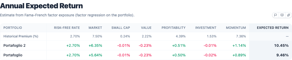
A table estimate of each portfolio's annual expected return, built from a fixed formula: start from a 2.7% risk-free rate, then add the contribution of each Fama-French factor, where each contribution is the portfolio's estimated exposure (beta) to that factor, multiplied by that factor's long-run historical risk premium:
where is the portfolio's exposure to factor (from the same regression as Risk factor exposure) and is that factor's fixed long-run premium:
| Factor | Long-run premium |
|---|---|
| Market (Mkt-RF) | 7.50% |
| Size (SMB) | 0.24% |
| Value (HML) | 2.22% |
| Profitability (RMW) | 4.39% |
| Investment (CMA) | 1.53% |
| Momentum (Mom) | 7.36% |
The premiums above are fixed constants, not re-estimated from your specific backtest period. That's the honest limitation of this chart: it tells you what the portfolio's factor tilts would have earned at long-run average premiums, not what those premiums actually did during your exact window. Treat it as a structural estimate, one more data point next to the historical CAGR, not a replacement for it.
Holding-period returns
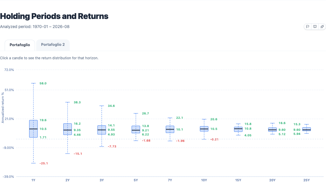
For each horizon (1 to 25 years) the chart takes every historical window of that length in the backtest, computes its annualised return, and summarises the distribution as a box-and-whisker plot: minimum, lower quartile, median, upper quartile, maximum. The whiskers are the actual sample minimum and maximum, not statistical outlier fences, so what you see is genuinely the best and worst N-year stretch that occurred, not a model of one. It answers "what actually happened, historically, if you held this portfolio for N years": not a forecast, a record.
The box (lower to upper quartile) holds roughly the middle half of outcomes. Longer horizons usually shrink the box: extreme results get rarer as the holding period stretches, which is what "time diversification" means in practice, and it's the cleanest visual argument this page has for staying invested longer rather than trying to time entries. Hover a box for the exact quartiles and how many historical windows fed into it, worth checking because a 20-year box built from only a handful of independent 20-year windows carries a lot less statistical weight than a 1-year box built from hundreds of overlapping 1-year windows.
Monte Carlo
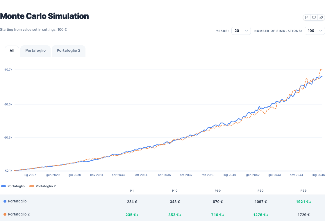
A bootstrap simulation, not a parametric one. For every simulated month, the engine picks one random month, with replacement, from the portfolio's own historical monthly returns and applies it; repeat that for the number of years you asked for to build one path, then repeat the whole thing up to 10,000 times and read off percentiles across all the paths at each point in time. Set the number of simulations and years, then run it. The colored bands read as pessimistic, median and optimistic scenarios. Hover any curve for the year and expected value.
Because it resamples your portfolio's real monthly returns rather than a normal distribution, it naturally reproduces whatever fat tails or skew your actual history had; what it does not reproduce is the order those returns came in. Each simulated month is drawn independently, so a real six-month losing streak becomes, at best, six unlucky months scattered randomly across different years in the simulation. If sequencing matters to your question (what happens if a crash hits right when I retire, for instance), Ongaro below is built for exactly that, at the cost of using far fewer independent samples.
Efficient frontier
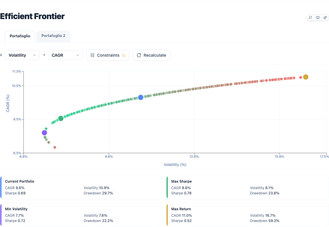
Simulated portfolios plotted in the risk-return plane. The engine samples random weight combinations for your holdings (respecting any min/max constraints you set under Constraints), runs a full backtest on each one, and keeps sampling until it has found 300 portfolios or made 10,500 attempts, whichever comes first, since not every random weight draw produces a usefully distinct point.
- Key points: Max Sharpe, Min Volatility, Max Return.
- Interactivity: click any point to see that simulated portfolio's composition.
- Your portfolio appears as its own colored point on the map.
One important caveat, because it's the most common misreading: the frontier is built on past data. The historical Max Sharpe portfolio is the one that would have been optimal, not the one that will be. Re-running the frontier on a different date range for the same assets can move those key points meaningfully, which is itself informative: a frontier that looks similar across several different sub-periods reflects a genuinely stable trade-off, one that only looks good over one specific window is fitting that window. Use the chart to understand the shape of the risk-return trade-off, not as an instruction for what to buy.
Ongaro historical simulation
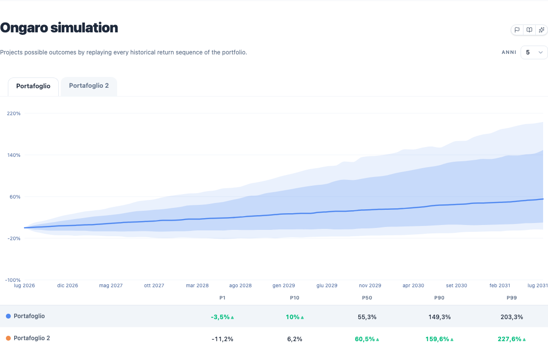
Where Monte Carlo reshuffles individual months at random, Ongaro replays only real historical windows, kept in their original order. For a chosen horizon (default 20 years, adjustable), it takes every continuous historical window of that length in the backtest, normalises each to 100 at the start, and computes percentiles of the outcomes at every point in time. A real six-month losing streak stays a connected six-month losing streak inside whichever simulated window it belongs to, instead of being broken up. In practice: how the portfolio would have performed "in the years ahead" if the future repeated one of the periods observed in the past. No random draws, no distributional assumptions, and no assumption that months are independent of each other.
- Choose the horizon in years. The horizontal axis is time into the future (0 → horizon), not calendar dates.
- Run the simulation: for every month up to the horizon it scans all possible historical windows and builds P1, P5, P10, P50, P90, P95 of cumulative returns.
- Use the percentile toggles to show or hide extreme, conservative, median and optimistic scenarios.
- Hover any curve to read the outcome at a given point in the future.
The cost of preserving real sequencing is sample size: a 20-year Ongaro window on a 40-year backtest only has roughly 20 independent 20-year stretches to draw from (heavily overlapping ones, at that), versus up to 10,000 independent draws for Monte Carlo. That's why the tool needs about 20 years of common history by default before it will run at all, it needs enough calendar time to assemble a meaningful set of non-trivial windows. Use it to see how often, historically, a given horizon produced very negative (P1/P5/P10) or very positive (P90/P95) results for this exact portfolio: the closest thing to a "range of real outcomes" the backtester can show you.