Charts: Dani Score
The exact formulas behind reliability, diversification, expected return, performance, stability and simplicity.
The Dani Score condenses a portfolio into a single 0–10 number and a five-dimension breakdown. Unlike the rest of the backtester, which mostly shows you raw historical data, every number on this tab comes from a fixed scoring formula, the same formula for every portfolio. This page documents those formulas so the score never has to be a black box.
Reliability
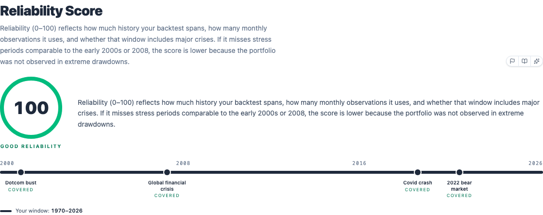
A 0–100 score on whether the analysed history is long and rich enough to trust the breakdown below, shown before the score itself for a reason: a 9.5/10 Dani Score built on three years of calm markets deserves far less confidence than the same 9.5/10 built on thirty years that survived two crashes.
The formula compares your backtest window to a roughly 20-year reference (about as long as a well-known global equity ETF's real track record), averaging two ratios: your window's length in years divided by 20, and your number of monthly observations divided by 240. That average is then capped so a window shorter than 22 years can never reach a perfect 10, however dense its data. The is two flat one-point penalties: one if the window doesn't cover the 2000–2002 dot-com bust, one if it doesn't cover the 2008 financial crisis. Multiply the result by 10 and that's the percentage on the gauge.
The timeline below the gauge also marks the Covid crash (2020) and the 2022 bear market as covered or missed, for context, but only dot-com and 2008 actually subtract points. A window that covers Covid and 2022 but misses both 2000 and 2008 still takes the same 2-point malus as a window that covers neither: the score cares about having lived through the two deepest, longest stress tests in the modern data, not about coverage in general. A low score is a reason to extend the backtest period or lean on reconstructed ETF histories before trusting the numbers below, not a reason to distrust the concept of the score itself.
Score and breakdown
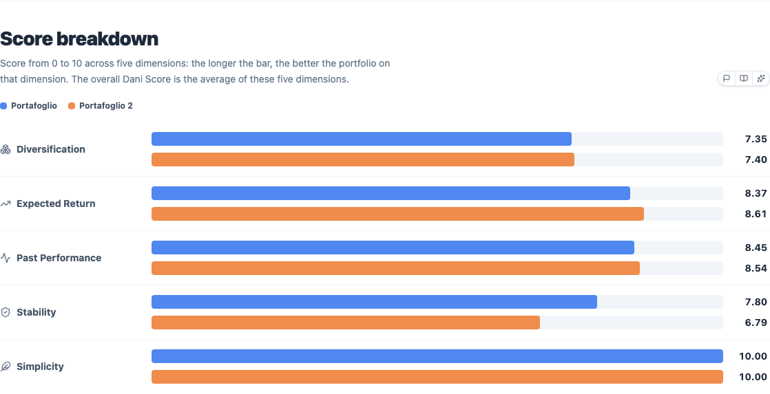
The total score (0–10, shown at the top of the tab) is the plain average of five dimension scores, each computed independently and each worth exactly one fifth of the total: Diversification, Expected Return, Past Performance, Stability, Simplicity. With more than one portfolio the bars for each dimension sit stacked by color, so you can see at a glance which dimension is driving the difference between two portfolios that otherwise look similar, instead of just comparing two final numbers.
The five formulas, in the order they're averaged:
Diversification. A weighted blend of how many holdings you're exposed to, how many countries and sectors, and how evenly spread the weights are within those:
Holdings depth is log-scaled, so going from 100 to 1,000 holdings matters more than going from 4,000 to 4,900:
Country and sector coverage are square-root-scaled shares of a reference count (40 countries, 12 sectors):
Evenness comes from the Herfindahl-Hirschman Index (the same concentration measure used in antitrust economics), so a portfolio spread evenly across its countries scores higher than one with the same country count but one dominant country:
(sector evenness mirrors the same formula on sector weights). On top of that weighted sum, a penalty subtracts points if the portfolio's underlying holdings count falls below 1,000, with a second, steeper penalty below 500; a +0.5 bonus applies if commodities (gold, silver, other precious metals) are detected in the holdings, and another +0.5 if government bonds are, since both diversify a portfolio in ways pure equity-and-corporate-bond counting misses.
Expected Return. Reuses the same 0–10 scoring bands as Past Performance below, but applied to the Fama-French expected return estimate instead of the realised CAGR: it's asking "how good does the structural, forward-looking number look", not "how good was the historical number."
Past Performance. Scored directly off CAGR, in increasingly steep bands:
The bands get progressively harder to climb on purpose: the jump from a 4% to an 8% CAGR is worth as much as the jump from 8% all the way to 15%.
Stability. Scored off annualised volatility , lower is better:
This dimension is doing the same job as Sharpe or Sortino elsewhere in the backtester, expressing "how rough was the ride" as a 0–10 number instead of a ratio.
Simplicity. The only dimension with nothing to do with returns or risk:
Five ETFs or fewer score a full 10; each additional ETF past 5 costs half a point. It exists because a portfolio that's harder to maintain is more likely to be abandoned or mismanaged by its actual owner, which is a real cost that the other four dimensions can't see.
Why each dimension scored the way it did
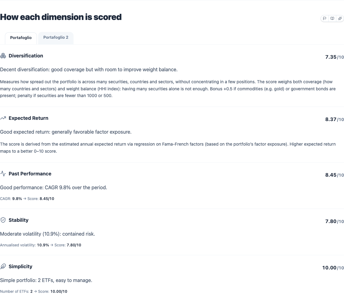
For each of the five dimensions, a plain-language explanation of how it was calculated for this specific portfolio, together with the raw inputs that fed into it: volatility, CAGR, ETF count, holdings count, and any bonus or penalty that applied, matching the formulas above line for line. This is the place to go when a score surprises you: it's built to answer "why is my Diversification a 4 and not an 8" without making you reverse-engineer the formula yourself, since it shows you the actual numbers that went in.