Charts: Performance
Metrics, cumulative curve, rolling returns, factors, drawdown and correlation, with the formulas behind every number.
The Performance tab is the default view after a backtest and the densest of the five: nine charts, from a one-screen summary table down to a correlation matrix. This page goes through all nine in the order they appear, with the formula behind each number where one exists.
Metrics at a glance
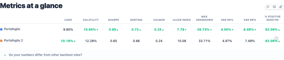
A table with every headline metric side by side, one row per portfolio: CAGR (or IRR with DCA), volatility, Sharpe, Sortino, Calmar, Ulcer Index, Max Drawdown, VaR 95%, VaR 99%, and % of positive months. It's the summary strip's four numbers extended to the full set, so you can compare portfolios on risk-adjusted terms without hunting for them deeper in the page.
The formulas, all built from the same monthly return series ( is the risk-free rate, the annualised volatility):
Volatility, the standard deviation of monthly returns, annualised:
Sharpe, return earned per unit of total risk, where "risk" counts upside and downside swings equally:
Sortino, the same idea, but the denominator only counts downside volatility (the standard deviation of the negative months). A portfolio with lumpy but always-positive returns can have a much higher Sortino than Sharpe:
Calmar, return per unit of the single worst peak-to-trough loss, rather than per unit of volatility:
Ulcer Index, the root-mean-square of the drawdown percentage at every point in the backtest, not just the worst one:
Two portfolios can share the same Max Drawdown and still have very different Ulcer Index values: one that recovered in six months barely moves the number, one that stayed underwater for six years drives it up. It's a depth-and-duration measure, which is why it shows up again as its own line in Value drawdowns below.
VaR 95% / VaR 99%, historical, not parametric:
The engine sorts every monthly return the backtest actually produced and reads off the value at the 5th and 1st percentile. It's asking "how bad was the worst 1-in-20 (or 1-in-100) month that really happened", not fitting a bell curve and extrapolating a tail.
Performance over time
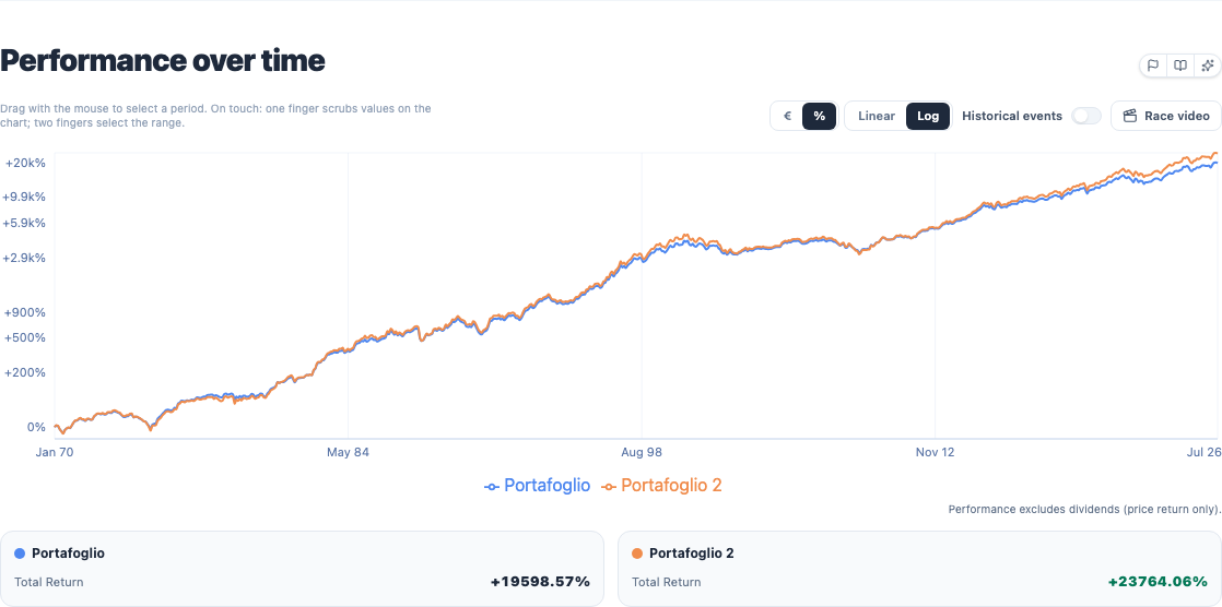
The curve of portfolio value over time: base 100 for a lump-sum investment, or the value in euro when DCA is active. Hover a line for date and value, click a portfolio's name in the legend to hide that line (click it again to bring it back), and switch to log scale to compare relative moves across periods of very different absolute size.
Log scale matters more than it looks. On a linear chart, a portfolio that grows from 100 to 200 and one that grows from 1,000 to 2,000 look nothing alike, even though both doubled. On a log chart, equal percentage moves take up equal vertical space, so the shape of the curve reflects rate of growth rather than raw distance travelled. Early history on a 20-year backtest almost always looks flatter than it should on a linear chart, purely because the euro amounts involved were smaller.
With inflation enabled you get two curves per portfolio, real and nominal; with DCA enabled the cumulative-deposits line appears alongside it so you can see contributions versus growth.
Individual asset performance
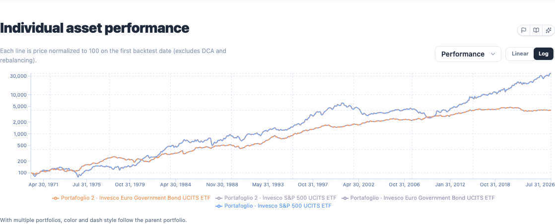
Each holding's own price path, shown separately from the portfolio's combined curve above. Useful for the question the cumulative chart can't answer on its own: which asset drove the result? A 60/40 portfolio's curve tells you the blend returned 6% a year; this chart tells you whether that came from equities doing the work while bonds dragged, or the other way around. Only shown when the portfolio holds more than one asset.
This is also where a rebalancing effect hides in plain sight: if one asset's own curve massively outran the portfolio's curve, periodic rebalancing was selling the winner along the way to fund the loser, which is exactly what a fixed-allocation strategy is supposed to do. It looks like a cost on this chart and shows up as a benefit in risk-adjusted terms.
Return heatmap
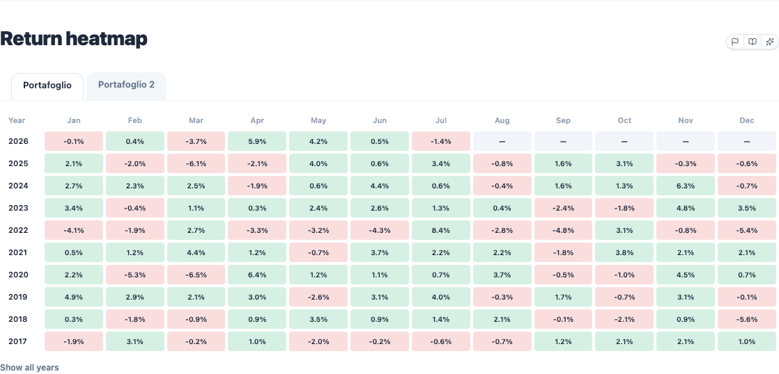
Each month's return laid out as a grid: rows are years, columns are months, one cell per calendar month in the backtest. Stronger colors mark larger moves; positive and negative cells make it easy to spot favourable and difficult stretches, and any seasonality across months. With several years of history, expand it with Show all years.
This is a plain month-over-month percentage change, nothing rolling or annualised about it, so each cell answers exactly one question: how did this specific month go. Scan a row for a bad year and you'll usually find it's driven by two or three red cells, not twelve mediocre ones, which is the heatmap's real value: it shows you whether a loss was one sharp shock or a slow grind.
Rolling returns
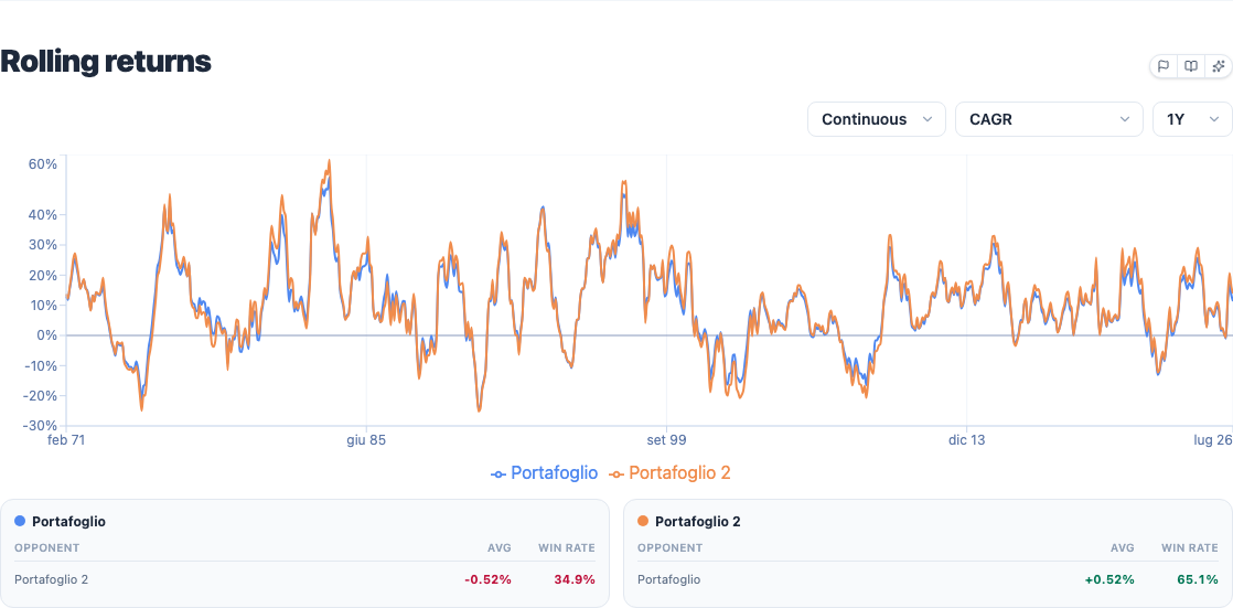
The chart worth studying if you only study one: it shows a moving average over the horizon you choose, instead of the single number the cumulative curve happens to produce for the exact period you picked.
- Metric: the dropdown switches between CAGR, volatility and Sharpe.
- Horizon: the dropdown (1Y, 3Y, 5Y…) sets the rolling window length.
- View: Continuous draws a line over time; Annual shows year-by-year bars (December values only); Distribution draws a histogram of all the values.
Below the chart: in Continuous or Annual view with more than one portfolio, each one gets a head-to-head panel with its average outperformance and win rate against the others; in Distribution view, a table shows the mean and median instead.
The reason this matters more than the cumulative curve: that curve tells the story of someone who entered on exactly day one. Rolling returns tell you how much the result would have changed if you'd entered a year later, or five. A backtest with a great cumulative return and a rolling 5-year CAGR that swings from −3% to +18% is a very different portfolio to hold than one whose rolling 5-year CAGR stays between 5% and 9% the whole time, even if their endpoint numbers match.
Risk factor exposure
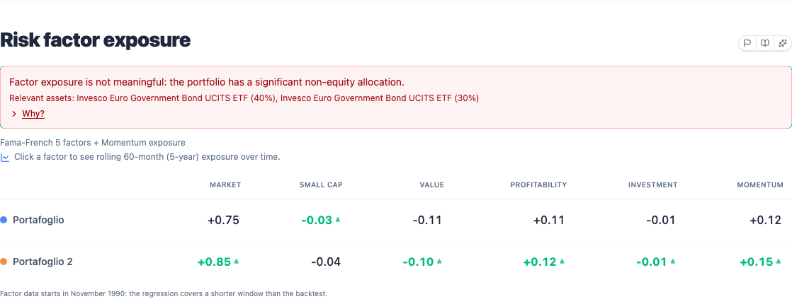
Exposure to the Fama-French factors (market, size, value, profitability, investment) plus momentum, one row per portfolio. A multivariate ordinary least-squares (OLS) regression estimates each beta from the portfolio's monthly excess returns and all six factor return series at once. Positive values mean long exposure to that factor, negative means short. Select a factor in the app to see how its beta changed in rolling 60-month (five-year) regressions; the dashed line is the full-period beta. See Formulas and metrics for the model and its caveats.
Requires at least three years of common history to estimate reliably, and the app will warn you outright when a portfolio's non-equity allocation (bonds, cash) makes the regression not meaningful: factor exposure is an equity-market model, not a whole-portfolio one, so a 60/40 portfolio's factor loadings describe the equity sleeve's tilt, not the bonds sitting next to it.
The reason is that the Fama-French factors (market, value, momentum, etc.) explain stock returns, not bonds, gold, or crypto, which follow different logic (rates, inflation, supply/demand) that those factors don't describe. With a significant non-equity allocation the regression still produces a number, but the result mixes incomparable things: treat it as a very rough indication at best, or ignore it.
Value drawdowns
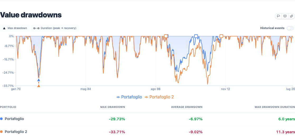
How far the portfolio fell from its previous peak, at every point in time: the first series is drawn as a filled area, additional portfolios as lines. This is the chart genuinely worth studying, because the variable people underestimate isn't "how much did I lose" but "how many years did I spend looking at a red number": recovery time, not just depth.
The table below the chart makes that explicit with a max drawdown duration column alongside the max and average drawdown. Two portfolios can post the same −30% worst case and still be very different investments: one that spent 18 months underwater before a new high asks much less of you than one that took 6 years. If you only remember one number from this chart, make it the duration, not the depth.
Losses by holding period
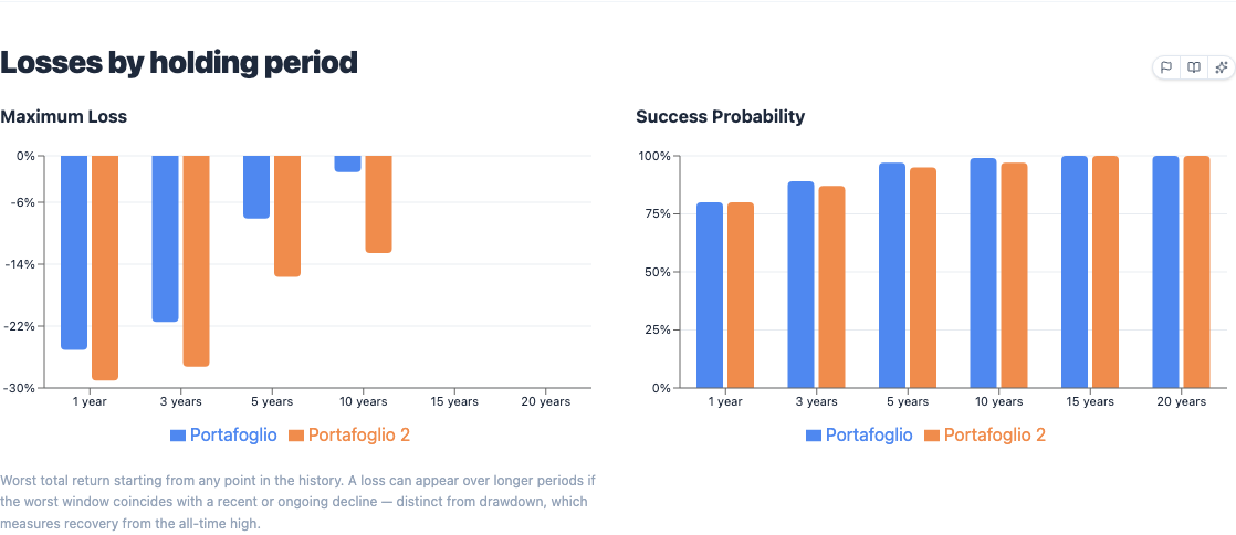
Two views built from every historical rolling window in the backtest, split by horizon (1, 3, 5, 10, 15, 20 years):
- Worst loss: the deepest drawdown observed for a holding of that length.
- Success probability: the share of historical windows of that length that closed positive.
Read them together: the left chart tells you the worst case you could have lived through at each horizon, the right one tells you how often, historically, that horizon worked out. Worst loss here is a different measurement from Max Drawdown above: drawdown tracks decline from an all-time peak regardless of when you started, while this chart asks "starting from any point in history, what's the worst total return I could have gotten by holding for exactly N years." A loss can show up here even without a deep drawdown, if the window happens to start high and end low without much happening in between.
Correlation matrix
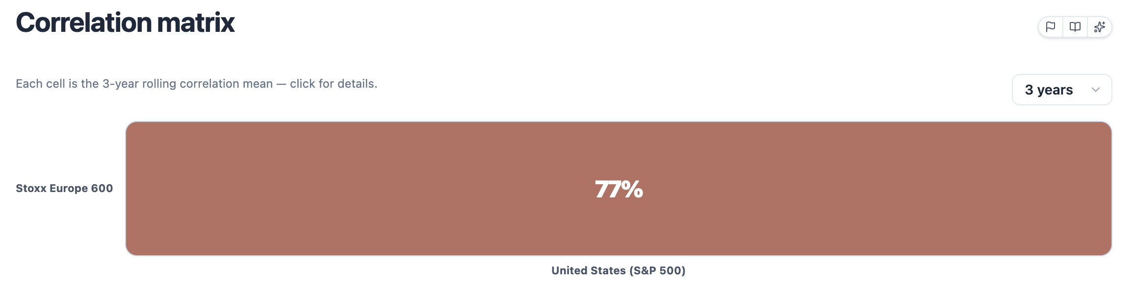
How much the returns of two holdings move together, on a scale from −100% to +100%.
- +100% (perfect correlation): the two always move by the same amount, so holding both doesn't reduce risk.
- 0% (no correlation): movements are independent, so combining them lowers volatility without giving up return.
- −100% (perfect inverse correlation): one rises exactly as the other falls, ideal for hedging, rare in practice.
Hover a cell for the exact value and the full names of both assets; click to fix the focus on one pair. Shown only when a portfolio holds at least two assets. Correlation is measured on the same monthly return series as everything else on this page, which is worth remembering when a pair that "should" be uncorrelated on paper (say, two different equity regions) shows up at +85%: during sharp sell-offs, correlations across almost everything tend to rise together, and a matrix built on a period that includes 2008 or 2020 will reflect that.