Charts: Composition
Geographic and sector breakdown, top holdings, overlap, weight evolution and tax impact.
The Composition tab looks past the ETF wrapper to what's actually inside your portfolio: which companies, which countries, how much overlap between funds that look different on paper, and how the allocation actually behaved over time versus what you set out to hold.
Country, currency and sector breakdown
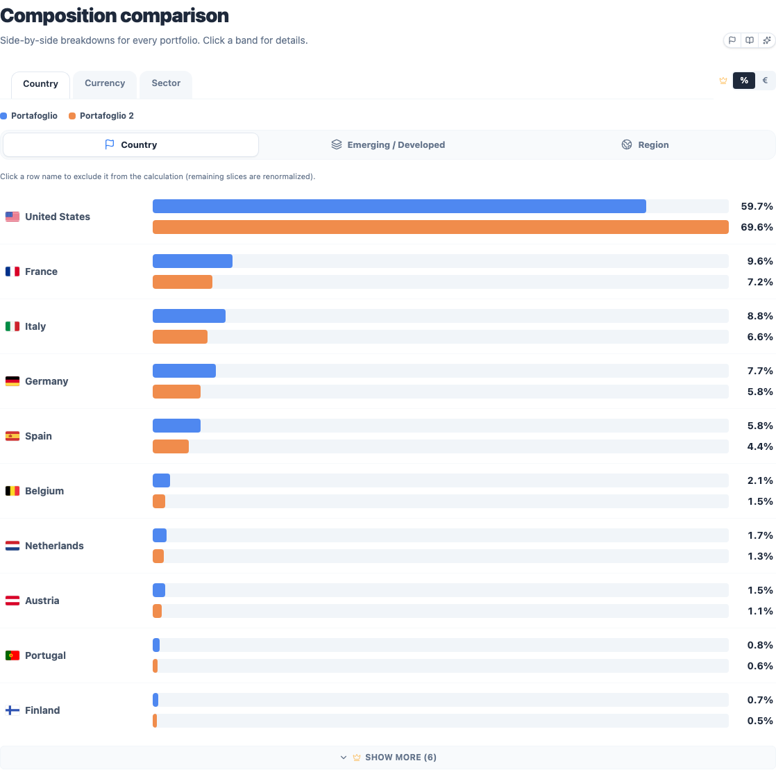
The portfolio broken down by country, currency and sector, with tabs to switch between the three views. In the country view you can change the aggregation level (single country, market tier, or broad geographic area) and click a row to drill into it. With more than one portfolio the views sit side by side, so you can see where each one is concentrated.
This is where "different ETFs" and "different exposure" stop being the same claim. Two portfolios built from ETFs with completely different names and providers can turn out to hold nearly identical underlying exposure, both weighted 60% United States, 20% technology, once you look through the wrapper. Conversely, two portfolios that look similar because they both say "World" in the name can differ meaningfully in currency exposure depending on which hedging share class you picked. The breakdown is the fastest way to catch either case before it surprises you in a drawdown.
Top holdings
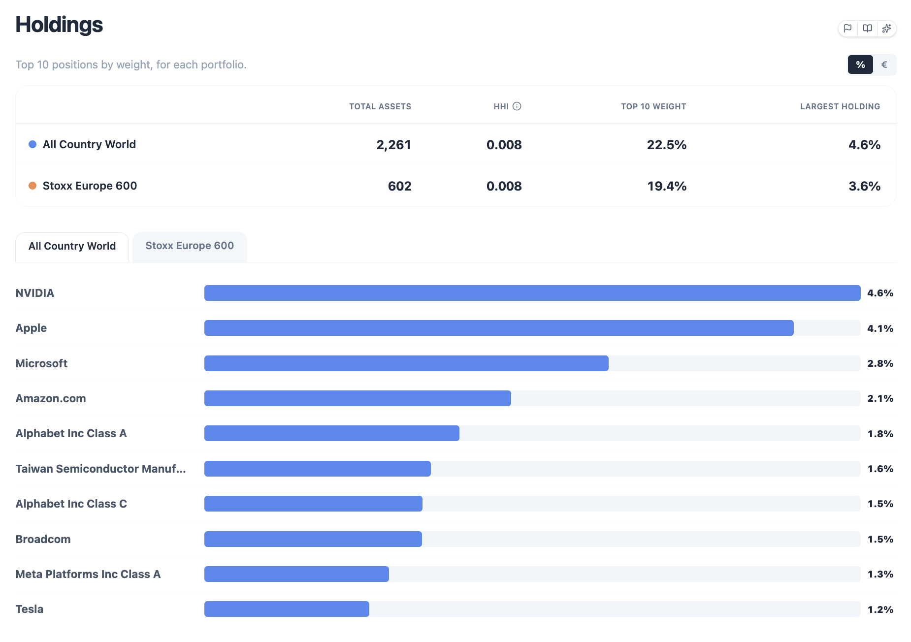
The ten largest individual holdings in the portfolio, pulled from each fund's underlying exposure data: not just the ETF-level weights you set, but what's inside them. With a single portfolio this is a stats-rail (total assets, HHI, top-10 weight) plus the ranked list. With more than one portfolio it becomes a summary table, one row per portfolio, so it stays readable no matter how many you're comparing; click a row to expand its ranked list of individual holdings.
A high concentration here means diversification across ETFs is doing less work than it looks like, and it's a genuinely common failure mode: a "3-fund portfolio" of a US total-market ETF, an international developed-markets ETF and an emerging-markets ETF can still have the same five or six mega-cap tech names showing up as top holdings in two of the three funds simultaneously. The number of ETFs you hold and the number of distinct large positions you're actually exposed to are not the same number.
Herfindahl index (HHI)
HHI answers one question: how concentrated is the portfolio in the actual companies, not the ETFs. A higher HHI means a few holdings carry more of the weight. Same "3-fund portfolio isn't actually diversified" problem as above, as a number.
How it is calculated: for every holding, take its weight in the whole portfolio (5% = 0.05), square it, and add up every square — not just the top ten on the ranked list.
- Equal weights across names → (the minimum for that count)
- One name at 100% → (the maximum)
- The more lopsided the weights, the higher HHI goes
Overlap matrix
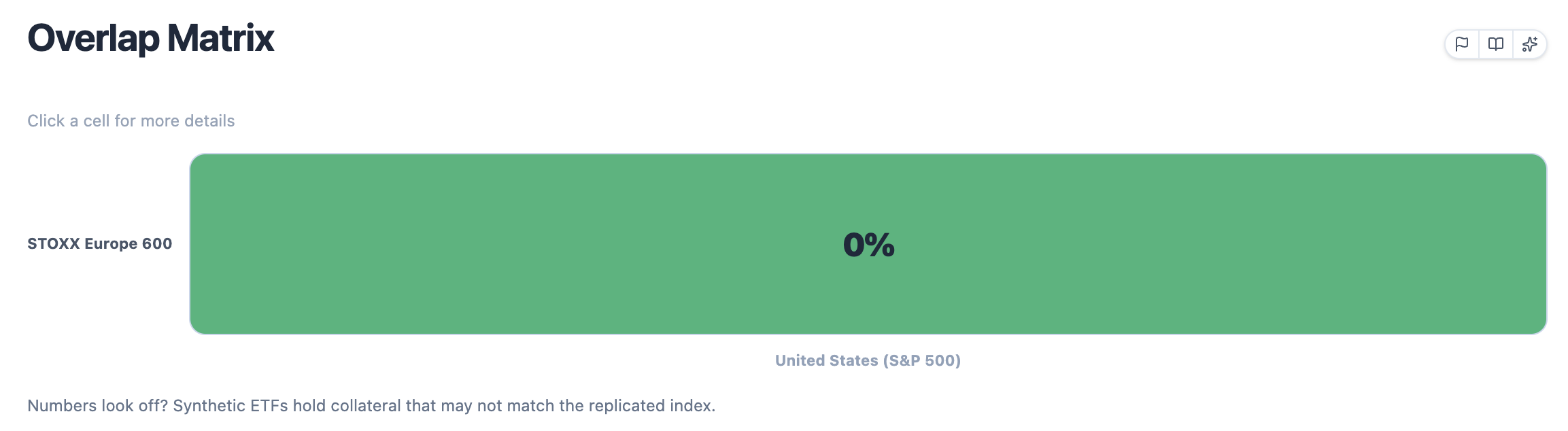
The share of holdings two ETFs have in common, as a percentage of the portfolio:
For every holding the two funds share, the engine takes the smaller of the two weights and adds it to the total; a name that's 4% of fund A and 6% of fund B contributes 4 points to the overlap. That's the standard way to read "how much of my money is effectively duplicated if I hold both of these", and it's why the number is capped at 100% and symmetric between any given pair.
This is the matrix that surprises people most: two funds with completely different names and marketing can hold largely the same companies, in which case the portfolio's apparent diversification is much higher than the real one, and this chart is what catches it. Hover a cell for the exact value, click it for the list of shared holdings and their weights. If a number looks wrong, especially for a synthetic or swap-based ETF, remember that some of those funds hold equity collateral that doesn't match the index they're replicating; the underlying-holdings data this chart reads reflects what the fund actually owns, not what its factsheet describes.
Weight evolution
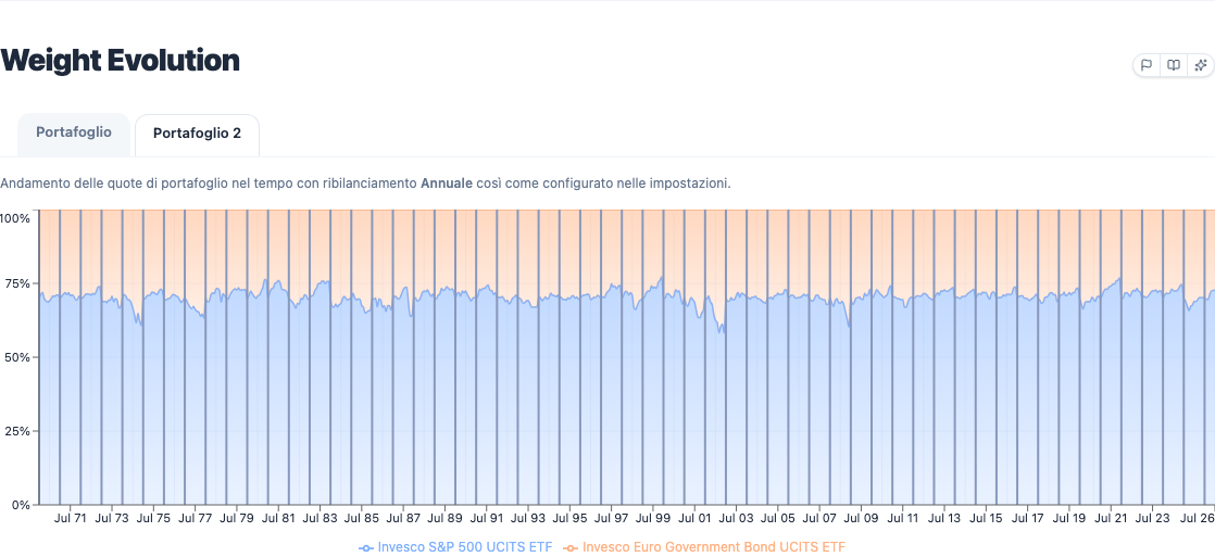
How each holding's weight drifted over time, as a stacked area, including markers for rebalances and, when enabled, commission events. This is the picture behind the abstract idea of "drift": a 60/40 portfolio without rebalancing doesn't stay 60/40, and this chart shows exactly when and how far it wandered before each correction pulled it back. See Rebalancing for how the different strategies (periodic, drift-based, none) change the shape of this exact chart.
Read it alongside Value drawdowns in the Performance tab: a portfolio whose equity sleeve drifted from 60% up toward 75% right before a crash carried more risk at the worst possible moment than its target allocation suggests, and this chart is where that shows up first.
Tax impact
When capital gains tax or stamp duty are enabled in settings, this section adds the realized gains and tax-drag charts on top of the composition view, so you can see how much of the gross return the tax treatment consumed. Tax events here are tied to the same rebalancing schedule shown above: a portfolio that rebalances more often realizes more gains along the way, which is also visible directly in the weight evolution markers.