Charts: Comparison
Wealth ratio, rolling correlation and linear regression between two portfolios.
The Comparison tab only appears once you're analysing at least two portfolios. It's three charts, all built around a pair you pick from a dropdown: pick the two you actually want to compare, not necessarily the first two in your list.
Wealth ratio
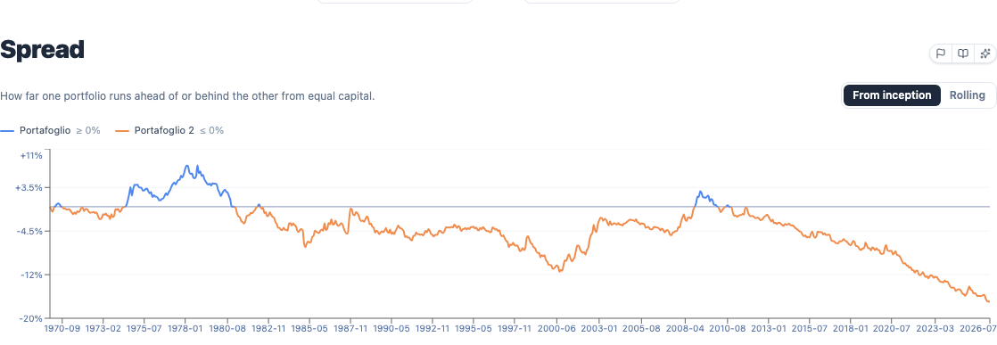
The ratio between the two portfolios' normalised values, month by month, over their overlapping history, displayed as a percentage spread:
Above the parity line () the first portfolio is relatively ahead; below it, the second is. It's a more direct way to see who's winning right now than eyeballing two overlapping curves on the main chart above. Those two lines can look close while diverging steadily, and this view makes the trend explicit.
A toggle switches between From inception (the spread accumulated since the start of the common period, which can only ever grow in magnitude) and Rolling, which resets the comparison to a moving window instead, useful for asking "who's been winning lately" rather than "who's been winning since the beginning."
Rolling correlation
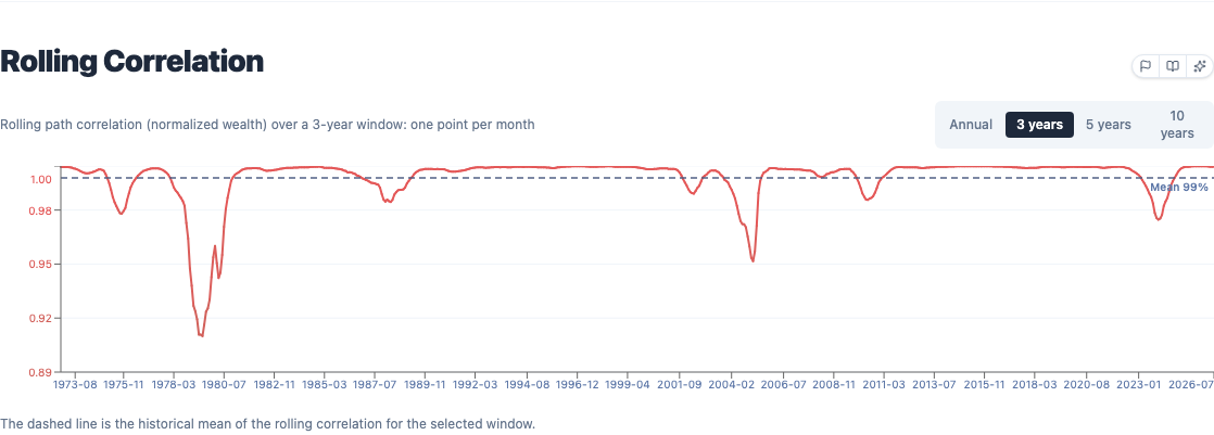
Correlation between the two portfolios' monthly returns, computed over a rolling window. The horizon selector offers four presets, Annual (12 months), 3 years (36 months), 5 years (60 months) and 10 years (120 months), each redrawing the whole line at that window length rather than just changing where you're looking on a fixed line. Values run from −1 to +1. Useful for checking whether two portfolios that look different in composition behave differently, or whether they've been moving together for years despite the different holdings.
Linear regression
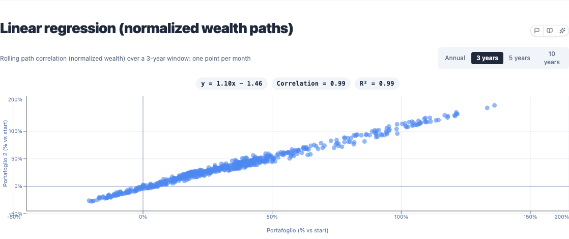
A scatter plot using the same rolling-window horizon as Rolling Correlation above (3 years by default): each point is one window, plotting the first portfolio's total return over that window on one axis against the second portfolio's total return over the same window on the other. It is not a cumulative view from the start of the backtest, despite the axis label reading "% vs start", that label describes the return within each window, not since inception; a genuinely cumulative version would blow past readable chart scale on a multi-decade backtest.
The line fitted through the scatter is an ordinary least-squares regression of one portfolio's window return on the other's:
The formula above the chart gives slope (), correlation and R²: a slope near 1 with a tight, high-R² cluster means the two have tracked each other closely across those windows; a flat or scattered cloud means they haven't. With only two series, R² is just the correlation squared,
so it doesn't add independent information here, it's the same relationship expressed as "share of variance explained" instead of a −1..+1 score, which is why a correlation of 0.99 shows up as an R² of roughly 0.98.